
Description
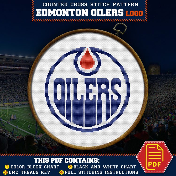
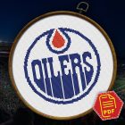
Edmonton Oilers logo cross stitch pattern, available for instant download as a 5-page PDF file.
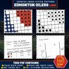
What’s Included in Your Download:
-
- An image of the finished embroidery
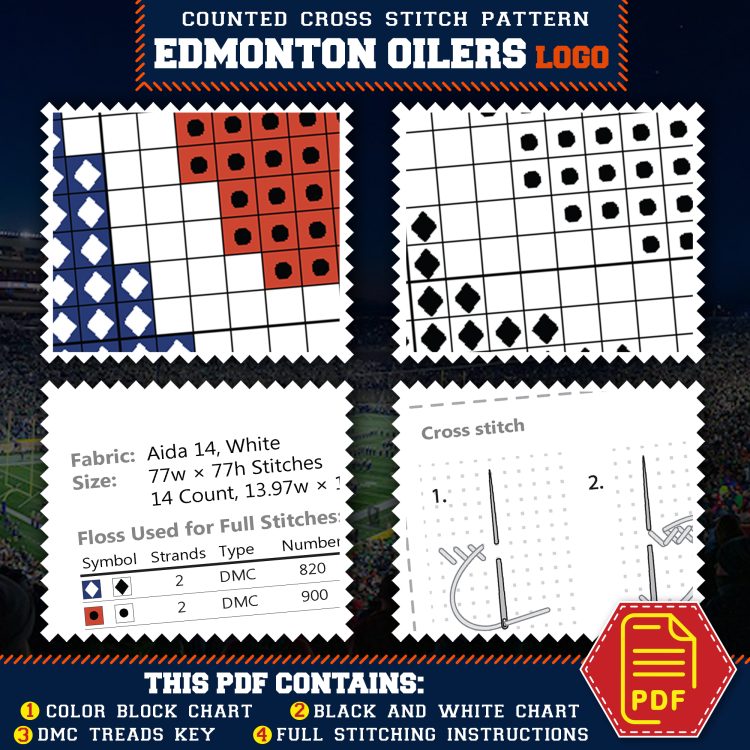
- A color block pattern with grid lines
- A black and white symbols pattern
- A key for DMC floss colors and Stitch Guide
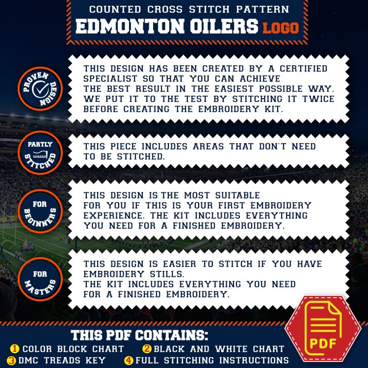
- Basic Rules of Embroidery manual
Requirements: Any PDF reader to open and view the file.
Edmonton Oilers
The Edmonton Oilers, a prominent NHL team, are known for their dynamic play and rich history, highlighted by multiple Stanley Cup championships. Established in 1972, the Oilers have built a legacy of excellence and innovation, with a passionate fanbase supporting their iconic blue and orange colors. Their commitment to success and tradition has made the Oilers a symbol of hockey greatness and enduring legacy.
Why Blue and Orange
The colors Blue and Orange were officially adopted as the Edmonton Oilers’ colors in 1972. These colors hold deep significance, representing more than just the team’s identity. “Blue” symbolizes the strength and determination of the players, while “Orange” reflects the energy and passion of the fans. These colors were chosen to represent the vibrant spirit of Edmonton and have become a symbol of tradition and pride that has endured through the decades.
The Oil Drop Mascot
The mascot of the Edmonton Oilers, the Oil Drop, brings with it tales of resilience and community spirit. The oil drop symbolizes the heart of Edmonton’s economy and heritage, deeply rooted in the oil industry. Various theories exist about the origin of this mascot, ranging from the city’s nickname “Oil Capital of Canada” to the pivotal role oil played in shaping Alberta’s prosperity. The most compelling is that Edmonton’s residents are as resourceful and steadfast as the oil industry itself. The Oilers’ choice to adopt the oil drop as their emblem reflects a commitment to honoring the city’s industrial heritage and the hardworking spirit of its people—resilient, innovative, and proud.


There are no reviews yet.